Organising anything with Trello is a joy:
- Web and mobile versions of Trello mean you can easily edit your projects from anywhere. A lot of writing apps aren’t so portable.
- Simple to use: intuitive, visual and very low barrier to entry
- All backed up to The Cloud ☁️
- Really easy to drag and drop images into cards, as well as adding checklists
- It’s freeeeeee
You might use Trello to manage projects, weddings, holidays… but a blog?
I’ve been experimenting with it for managing my blog posts.
Seeing the Forest
I often write in quite a… scattered way, with many ideas taking shape at once. Sometimes when I come back in the morning, it’s hard to see the forest for the trees. I’d forget what I was working on the day before, and duplicate notes without realising I’d already jotted them down elsewhere.
Most writing apps are not visual, and that means it’s easy for great content to get lost. The world might be robbed of consciousness-shifting insights for another week, maybe forever.
I wanted a more visual overview, and my first thought was obviously: Trello. I’d used it for project management many times, for moving house, going on holiday and even getting married! It excels at giving you a birds-eye view of lots of moving parts.
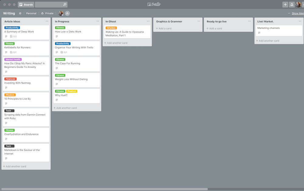
I moved all of my in progress writings across, tagged them by category, and marvelled at the result:

Finally, I could see everything at once, which made a huge difference for me!
In my first iteration, each list (the vertical stacks) represented a particular stage in the blogging pipeline, from ideas (far left), to in progress, to articles needing final checks.
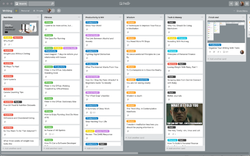
After some more fiddling, and migrating lots more blogs, I split the quickly overflowing “Ideas” list into multiple categorised lists, so that I could more easily see all the Fitness blog posts in one place, for example:

Writing Process
My process of blogging with Trello looks like this:
- When I have an idea, create a card with just a title
- Tag it via Trello labels: fitness, mindfulness etc, and move to appropriate column
- Starting adding notes to the Description of the card
a. Drag in images as appropriate
b. Add checklists to remind me of things to research 4. Move the card from left to right as it gets fleshed out 5. When the blog is mostly there I just copy the whole description into Ghost (my blog). It supports Markdown too so there are no formatting issues
Wins
What worked well?
- Easy image uploads. This means any media I want to include in the blog post can just be drag-dropped into the card without clogging up my Downloads.
- Easy to zoom in/out, which is a big thing for me. When a screen gets busy, you need to be able to zoom out easily. With Trello that’s as simple as
CMD + -(on Mac) - Whilst the content of a blog post grows in a linear way, titles jump all over the place, and finding the right title takes time. With Trello, the title is first and foremost, with actual content hidden away in the card.
- Trello labels make it easy to tag your content according to a topic.
- Trello gives you the tools required to use kanban to “move” articles through a pre-defined pipeline, and see your overall workflow at a glance.
- A huge win for me was that Trello supports Markdown. If I stick to Markdown, it doesn’t matter where my content lives, and it’s easily portable.
- Each Trello card can also have multiple checklists: these are great for adding reminders and listing websites/forums to market the blog after it’s gone live.
Limits
Unfortunately, it’s not feasible to do all your writing in the Description field of a card. The cursor resets each time you click in, and it’s lacking compared to other mature editors. It’s great for quickly adding notes, but not for a focused writing session.
Until Trello supports some kind of distraction-free writing mode, I just cut all the text into an instance of Sublime Text 3 that I have permanently running on a second desktop, in distraction-free mode.
Using Sublime Text For Focused Writing
Sublime Text is also friendly to Markdown, and with some tweaks it can become a classy writing tool. Sublime Text 3 is free for evaluation, I already had it installed and copying content back and forth between Trello and ST3 works without issue.
Here are the plugins I actually installed:
- MarkdownEditing for Markdown syntax and colours. It also removes the line numbers (restart required)
- You have to enable scrolling mode. On a Mac that’s
CMD + SHIFT + PthenTypewriter: Scrolling Mode (toggle) - Typewriter will keep your current line centred vertically whilst you type
- With the above setup, enter distraction free mode:
SHIFT + CTRL + CMD + F - If the text is too wide, try setting
View > Word Wrap Columnto70, and then bumping the font size down slightly
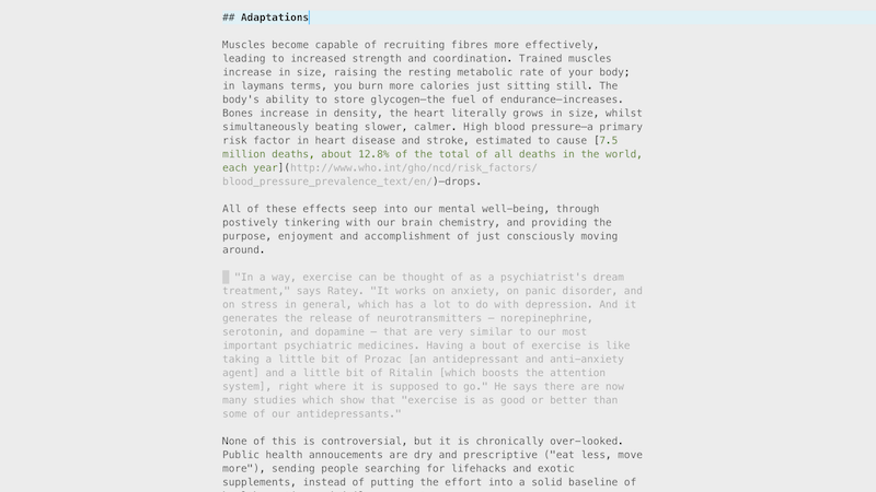
It ends up looking something like this:

Clean, undistracted. So when I’d really want to spend time on a blog post I’d copy the blog from Trello into ST3, go distraction-free for an hour, and then copy it back into the description afterwards. It sounds a little clunky, but it worked quite well and I enjoyed being able to hone in on one post.
Character limits!
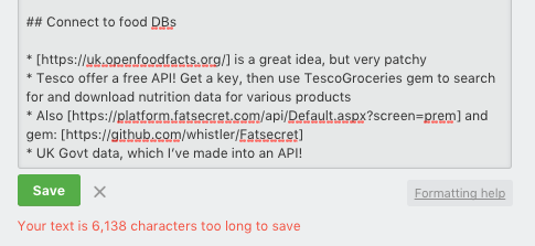
However, the biggest limit I hit—after migrating everything across to Trello!—was a character limit for the Description field of a card! 😱

I could not for the life of me find anything official from Trello on the description limit, but I believe it’s around 15,000 characters. This doesn’t translate into a lot of words—maybe 2500-3000?
Fortunately, most of my drafts are not this long, but I could see this becoming a problem for someone who frequently writes long-form. In my case, I’ve usually moved drafts into my Ghost blog itself by this point. As a bonus, I will still have the card in Trello to track progress through the pipeline, which helps me to remember all of the post-publishing marketing tasks.
That’s it! Get visual and give Trello a go.
Hey you.
Interested in inner work, wisdom and learning?
